moving on to big sur, this released but not yet supported version

No, I don’t know why there’s a big black dot in the upper right.

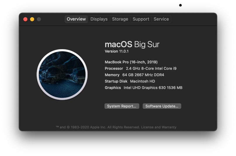
Yeah. In spite of all the dread warnings I went on ahead and updated to Big Sur, macOS 11.0.1. So far, nothing is horribly broken. There are, however, the humorous touches one finds in certain applications. Consider, for example, what Brew says when I go to run brew update:

Wow, I get to create pull requests against brew! Who’d of thunk it! Of course, I believe I use only a small subset of tools that are pretty generic when it comes to how they’ll build. I would imagine that there are some formulae (i.e. applications) that have a hard-coded macOS build environment. Or perhaps dependent upon a feature or two that is now more locked down in macOS 11. So far my upgrades haven’t failed. The only other failure is that macOS is now flagging an extension of HP’s Printer tools as dangerous. I personally consider HP software dangerous on general principals, but this is the first time Apple has pointed explicitly at HP.

Internally everything seems to be fine, and I don’t notice any performance issues. I am not too crazy about the iconography, however. macOS has been drifting from the flat UI theme to something more skeuomorphic. I’m not especially impressed. And I now have a bright outline to the Dock that just looks like ass.

more (correctable) annoyances with ios 14

I’m currently running with iOS/iPadOS 14.1, which was released last week. Before that latest update I was having issues with screen brightness and color across all my devices. I would sit looking at the device and see the brightness slowly increase, then slowly decrease, or else watch the hue shift from warm to cool and back again. Or both at the same time. That’s part of the feature set, folks.

I got so tired of it, so I went looking for all the ways to turn it off and just set my own screen brightness. First I went into Display and Brightness and turned off True Tone. That got rid of the crazy hue shifting. Then I had to go hunting further through Settings for more…

I finally stumbled upon Accessibility | Display and Text Size and made sure everything there was off. What surprised me is that Reduce Transparency and Increase Contrast were both enabled. I know I never touched those once, because it’s under Accessibility, and supposedly it’s for folks who actually need help accessing their iPhone. Once I disabled those, the look on my iPhone in particular matched what I used to get right up to the iPhone 8 and its iOS version, 11. The overall look when weird after that, which I know isn’t quite the technical term you’d like to read. But it was usable, I was busy, so I lived with the weirdness.

You’d think by now I would have nailed it all, but no, there’s one more setting which I’ll document here. At the bottom of Display and Text Size is Auto-Brightness. You have to turn that off as well. Once that’s all done, then the screen is just a screen, not some magic marketing checkbox.

The controls for controlling these “features” are all over the place in Settings. Silly me, I would have thought Auto-Brightness would be in Display & Brightness, not two levels down in Accessibility | Display and Text Size. Only a sadistic asshole Apple developer would design and implement it that way.

Now, with the latest version of iOS, all I have to do is swipe down from the upper left corner to get a control panel with the brightness widget, and set the screen brightness to a level I like. It really isn’t that hard to do, folks. The automagic capability in iOS is busted in my not-so-humble-opinion. I’m thankful that I can disable all that crap and do it on my own. Right now, I have screen brightness level set between a third and a half of the slider.